The Best Mobile App Development Design Trends

The best use of mobile phones are mobile applications, and we can not deny it. If we look around, we will see that there is a mobile application for everything now. This indicates that mobile app development services are growing at a rapid pace in the market. We exist in a time where a mobile application is the first approach of a customer to get things done. This makes the business owners shift their businesses to an online platform so that customers can find it easy to reach them. We saw how an online market did wonders for everyone in the pandemic. This gave everyone thought about how amazing it would be to have everything easily available to all the people through an online platform. The latest mobile app designs are the first thing you should work on when it comes to having a mobile application.
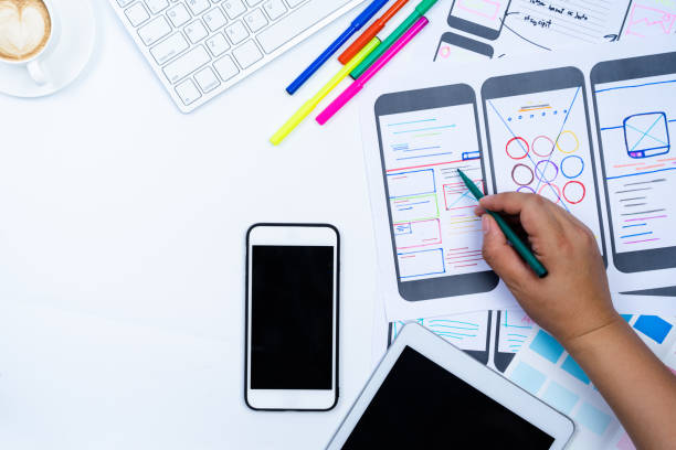
Even the websites that are made for the web are now created in such a way that they look fully responsive when opened on mobile phones. The mobile app development companies know how crucial it s for them to have the designs of the mobile applications be top-notch to make the customers use them for a longer time. There are so many things that have to be in consideration when we develop a mobile application, and getting the design right is the priority.
It will not matter how good the application is functionality-wise. If the design is lousy, the customers will never download it. How it makes the customers feel and how easily they navigate through the application is what makes them stick to it. The competition is always getting hard in the market, and this is why we must ensure to get all the aspects of the mobile app design right to have the customers drawing to us.
Ensure To Add These Aspects In Your Mobile App Design
Let us have a look at the following aspects that are so essential for mobile app development services companies. Ensure to have these added to your mobile application design and see the results in no time.
-
Swiping
In 2012, the famous application Tinder changed the game by having almost all applications working only on swiping. This increases more interaction and engagement with the user. Keeping this in mind, many mobile applications have added the swiping feature to be the prominent aspect.
The idea of swiping is not new as iPhone can be unlocked by swiping. The exciting thing is the use of swiping. As mobile devices have no buttons, the screen size is expanding. This lets the swiping do more work as it allows the user to move around and explore all the features in the mobile app.
Notice how the messaging apps and emails now delete the messages by swiping them. Also, many music applications allow us to change the soundtrack simply by swiping it. It makes the mobile app look clean and easily accessible. One swipe and you are at the home screen rather than tapping the back button multiple times.
-
The Color Gradients
How the colors appear in the mobile app design matters a lot to the customers. Remember the logo of Instagram in the beginning? It was a real-looking camera until it changed to a simplified logo with a golden and purple gradient. The colors can bring so much energy and life into the elements we see on that little mobile screen.
The emotions can be conveyed, and the messages can be sent. We have a specific color in the digital world already belonging to a particular message. Red indicates a failure, and green is used to show success. Adding the perfect colors to your mobile application will always help your customers attract you.
-
Strong Contrast
The dull and plain design is never a good idea for a mobile application. Besides, the competition in the market is also challenging, and to survive through it, the mobile application has to have strong contrasts. The brighter and higher screen resolution empowers you a chance to play with the contrasts.
The bold and high-contrast UI colors make your mobile application look sharp. The negative white space allows using more bright colors. The lines and shapes looking sharp on your mobile application can make it look amazing and catchy. You can have your fonts relevant to the type of content you use in the application to make it look attractive.
-
The Depth And Layers
Imagine a room with all the stuff scattered and untidy; that is how an unorganized mobile app looks like. The fonts that overlap, the varying levels of opacity, and poor colors with lousy shading are the factors that push the users away from your mobile application. Your UI is made relatively cleaner with the help of organized layers and in-depth UI. This will make your app’s UI tidy and appealing to the customers.
-
The Simple Approach
Having complication in the mobile application only make the UI look bad. The shapes being lousy will always be a drawback. The less complicated the UI is, the more interesting it will be for the customers. It depends on the overall working of the application and how easily it can make things work. Customers appreciate having an application that can help them do their work quite simply. The complicated functions and features never make the application look great.
Having a simple approach to things is all that we need here. This is why the mobile app design has to be researched well before being finally ready for the customers to use. A well-researched mobile app design can be seen at first glance, which is always the goal.
Conclusion
Mobile app development services are so essential for businesses these days. The increasing demand for good designs is something we must consider and work to get that right. Be it an IoT solutions company or a mobile app development company, they all have mobile applications being created for them to have the best results.


